Email CTA Design Best Practices

A captivating subject line and enthralling email copy are no doubt indispensable, but on occasion, they might not be enough to attract more clients to your website. This is because the spellbinding effect of the marketing email is transient and will not last long enough to convince your audience to interact with your business. But what if you could place a button that would convincingly lead your customer directly to a landing page on your website? This is where CTAs or call-to-actions come into play.
Table of Contents
What is a call to Action?
A CTA asks the customer to do more than just skim through the emails. Usually, the CTA will be a button that will encourage the recipient to click and take them to your webpage or another associated page. CTA buttons are eye-catchy and improve website visits.
What can you do to Improve your CTAs?
Use Action-oriented Words
You want to use verbs that stimulate the readers and make them click the button. CTAs like “click here,” “learn more,” and “shop now” have become cliched. You should try different phrasings which attract the attention of the reader and make them curious. Also, action words that force people to do something might be distressing for some readers.

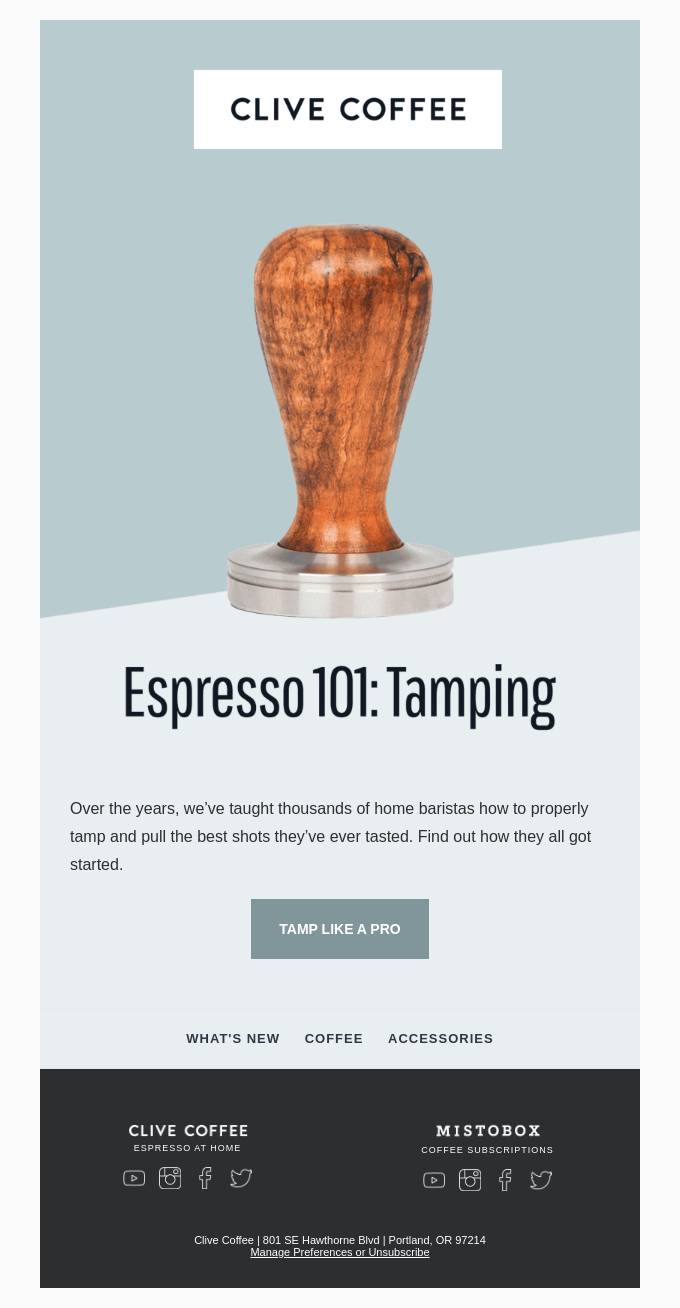
As you can see above, Clive coffee uses the phrase “Tamp Like A Pro” on its CTA button. It’s different; it is exciting and makes people want to click on the link. Additionally, the call to action preserves the aesthetics and the brand image of the company. Furthermore, the CTA provides a glimpse of what the consumer can expect from the landing page.
Get Your Placement Right
People are more likely to click on the CTA if the content of the email resonates with their current needs and situations. If the CTA is placed on top, it will most likely be ignored, as the reader will have no concrete reason to visit your website. Logically, the CTA must be placed at the end of your pitch or your offer. However, if you have a newsletter with multiple sections, you can use multiple CTAs that are well aligned with the flow of the narration.

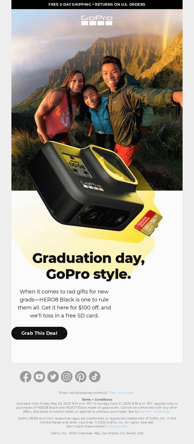
The CTA of the GoPro campaign maintains narrative as it first describes the deal and then asks the subscribers to act on it.
Use FOMO To Your Advantage
Often, people fear missing out on things that are potentially fun and exciting. Thankfully, you can capitalize on this irrational fear and use it to your advantage. When you create a time-bound offer, people will not want to miss it as they will think that they might not receive another offer like this in the future. This type of CTAs is mainly used in the email template designs for eCommerce websites.
You can use trigger words and phrases like “now” or “12 hours before the offer expires” to induce a sense of urgency. To get the best results, you should A/B test with a few words and phrases and choose the one with the highest response rate.

Rugs.com offers heavy discounts and incentives and completes the package with a call to action, making it seem like it is a once-in-a-lifetime sale. The recipients will rarely overlook an offer like this.
Leverage Your Email Template Design
The email template design should make the CTA hyperlink or the button stand out from the rest of the content. Contrasting colors work the best with hyperlinks. Likewise, brightly colored buttons can be used while designing the CTA buttons. Red, green, and orange-colored buttons are known to perform better than the others. However, it does not necessarily mean that you need to use them compulsorily.
The colors that you use should complement the aesthetics of your business. You should also use white space generously as it is an effective technique to catch the attention of your consumers. Additionally, reducing the clutter around the CTA button can significantly increase the conversion rate. The email template design by Grammarly employs this practice with their green CTA to make it even more noticeable.

Use Bulletproof CTA
When a CTA button is made using HTML code instead of an image, it’s referred to as a bulletproof CTA. Its function justifies the peculiarity of the name. Since the HTML embedded CTA will appear without fail, it’s considered a bulletproof method to use in your email template design. However, if you use an image as a CTA button, it might not render on devices of recipients who have disabled their image-viewing.
Be Wise With Size
Using a bigger CTA button might seem like you are imposing the offer on your readers. Readers will intentionally ignore emails that demand them to do certain things. Alternatively, a smaller button will not be able to grasp the reader’s attention. More often than not, people will choose a wider CTA button over a taller one. Therefore, while designing, try to place the action statement in a single line and a wider button. The shape of the button should also be proportionate to the surrounding font sizes and other design cues.

The call to action button in June’s email template design and the font size used seem too small compared to the fonts above.
Conclusion
An attractive email CTA will help you grab your readers’ attention and incentivize them to engage with your content, thereby increasing traffic to your website. Take into account the best practices highlighted above and craft the perfect CTA button for your business!
Author: Kevin George is the head of marketing at Email Uplers, that specializes in crafting Professional Email Templates, PSD to Email conversion, and Mailchimp Templates. Kevin loves gadgets, bikes & jazz, and he breathes email marketing. He enjoys sharing his insights and thoughts on email marketing best practices on email marketing blog.

